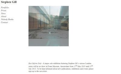
The second website I looked at was Stephen Gill's:
The home page is quite plain, a simple white background with black writing. A photo is also shown, but unlike Parr's website it isn't very big. I would personally prefer the image to be bigger, although a positive point is that the images are on a loop and change regularly.
The portfolio section of the website is pretty clear and easy to navigate, listing the different projects which can then be clicked on:
Once clicked on, the images grow to a much better size. There is a navigation bar at the bottom which allows you to skip to any image you want, and when hovering the mouse over them it gives you a small preview. I really like this feature.
The contact page is easy to find and very easy to understand. There are several ways to contact Gill, and this page also included where to contact for prints. A image is displayed above the information, all of which is centred, this makes it look better in my opinion.
Altogether I like Gill's website, despite how plain it is, this doesn't detract from the overall feel of the site. The navigation is easy to see on the left hand side, making it simple to move through the website and prevents any complications.


No comments:
Post a Comment