I have finished designing my website, and uploading images to it. After long consideration I finally decided to buy the domain name, as it will make my website look professional. It cost me £34 for two years, which I'm more than happy with.
Morgan Mayhew Photography
Thursday 18 April 2013
Tuesday 16 April 2013
Placement search update
I have received some replies to my emails, from Tom Ames Photography and Julian Mitchell Photography. Although they both declined by request for work experience, it was still really exciting to get responses and talk to people in the business.
Julian Mitchell's email:
 The fact he says he'll keep my name on file is promising, and I made sure to reply with my thanks.
Tom Ames' email:
 This email has given me the name of another photographer and his company, who I have looked up and also emailed. I plan to start ringing people in a week or two, if I receive no more replies.
Julian Mitchell's email:

Tom Ames' email:

Wednesday 10 April 2013
Market research
I have spent several hours researching into the portrait photography market, to see how many photographers and studios there are in Suffolk and beyond. The main thing I used for this research was Google and Google maps, which were more helpful than I thought they would be. The downfall of this method is that if a photographer/studio don't have a website then they won't necessarily be included. Another downfall is that the photography may not be working anymore, which I can overcome by checking the copyright date at the bottom of the page.
 This search has told me that there are roughly 25-30 portrait photographers in Suffolk, and a good 75% of these also do weddings. Below I'm going to make a list of prices they charge for weddings, on order to find an estimated average.
Sara Thomas Photography - £1200
Paul Jenkins Photography - £1055
Julian Mitchell Photography - £1200
Pja Photography - £1395
James Davidson Photography - £1750
Phillip Montgomery Photography - £1295
Thomas Ames Photography - £1050
F.E.A.D Photography - £325
Martin Beard Photography - £1050 (estimate)
A&G Wedding Photography - £795
I've calculated the average of just these ten photographers to be £1111. This tells me roughly how much wedding photographers make in the ares I live, and shows me the competition if I decide to go into the market myself. I have also just emailed almost every single person on the list, asking about work experience etc.

Saturday 30 March 2013
Contacting more placements pt 2
I have found another retouching company called Taylor James, which was founded in 1999 by Glen Taylor. They have been creating visual campaign's ever since then, using photography, CGI, live-action, and post-production.


I really love all the work they've created, and it has spurred me on even more to try and gain some experience in this field.

I found out their contacts details from their contact page, and decided to send them an email. I went into a little bit more detail about what my tutors have asked us to do, which I didn't do in my email to Metro. I'm thinking this might make a difference. Below is a screenshot of the email I sent:

That email was sent from my University email address, on the 20th of March. After ten days, I still haven't received a reply, so I plan to send another email from my personal email account. Below is a screenshot of that email:

If I don't receive a reply in another ten days I plan to ring them and ask someone, as it will get me an answer quickly.
Monday 25 March 2013
Contacting more placements pt 1
Another area I'm interested in is retouching, and have done some research into where I could contact to get a placement in this area. The first place I have looked is Metro Imaging in London, who have put together a very talented team of creative retouchers over the last twenty years. They work closely with their clients to achieve detailed and more than satisfactory outcomes.
 Above is their retouching page, which I had a look through before deciding I really liked the look of their work. There are a few ways I could have contacted them, and I chose to email them using the general enquiries option shown below.
 I proceeded to email Mr Window and ask if it would be possible for me to gain some work experience. Here is a screenshot of my email:
 To my surprise, I received a reply within 48 hours. Unfortunately, it wasn't good news. Here's a screenshot of my reply:
 Now that Metro has declined, I plan to look up more companies and get in contact with them too.


Monday 18 March 2013
Website preparation
I have finally decided that I want to use Weebly to make my website, as it's easy to use and reviews make it sound very trustworthy. In order to prepare myself for setting up the website, I have resized my images in photoshop.
 The original images were around 4000 pixels wide and I've resized them to 800, while I set the resolution to 72. Once I've done all my images I will start to design my website. It will include a page for portraits and a page for landscapes. As well as a selection of projects I've created for University. Constructing Narratives is the first one that we've been asked to include, I also plan to add my Documentary images, and photos of my Situated practise book. That is the minimum I plan to use, and will add personal projects at some point too.
Weebly allows you to connect straight to other websites such as Twitter, so I've decided to make myself a professional Twitter. In order to follow other photographers and galleries, to network myself with other professionals.
 I used an image of me photographing for my icon, and my background image is a photo I've taken for my latest University brief. I now follow a lot of photography and art twitters such as The V&A and Rankin. I will update it with anything to do with photography, and have already updated it on a photoshoot I did at the weekend. This was just the push I needed to create my professional account, as I've been debating whether to make one for ages.

Weebly allows you to connect straight to other websites such as Twitter, so I've decided to make myself a professional Twitter. In order to follow other photographers and galleries, to network myself with other professionals.

Tuesday 5 March 2013
Contacting placements
I have decided that I'd like to work in portraiture for my placement, and therefore have began searching for local photographers. Many I have come across also do wedding's, which I'm also open to trying.
 The first photographer I found was Tim Driver, I liked the look of his work and sent him an email. I have also telephones him twice, but have received no answer both times. I plan to send another email, and telephone a few more times to try and get a response.
 A friend of mine recommended the photography studio in Rendlesham, which is only a twenty minute drive away from where I live and therefore easy to get to. I rang the gentleman who works there and he informed me that there is currently no calling for weddings, but if more work crops up he will let me know.
 The third place I found is an actual studio as well as photographer, which is based in Ipswich so will also be easy to travel to. I have phoned the studio twice and received no answer, so my next plan of action is to go and visit the studio. That is the progress of my placement search so far.


Sunday 3 March 2013
Folio research 2
Books
Another possibility for displaying my work as a portfolio, is in a book. Silverprint also sell books which have four screws in the binding, this allows you to add more and more prints as you go.These look really nice, but are a lot more money than boxes.

I've also looked at making a book myself instead of buying one, a website that helps with this is Self Publish Be Happy.

Which is a site that promotes creating and publishing a book yourself. I would like to do this, but I don't feel that my work for narratives is suitable enough to go into a book. Therefore I think my final decision is to buy a portfolio box.
Folio research
Print boxes & Portfolio boxes
The next section of research I have done, is on portfolio presentation options. Namely; print boxes and portfolio boxes. Our tutors suggested print boxes, which is the first area I have investigated.
 The website I have looked at to begin my research is Silverprint. It is a well known company that supplies many items for photographers to display and store their work in. The above boxes vary in size and price, the smallest being 5 x 7" for £6.79, and the largest being A2 for £23.29. These boxes don't come in the size I'm thinking of which is 10 x 12", and I want to use this because it is the size of the paper I own and the original size of the prints for my narrative project.
 Another option for displaying my portfolio, is a portfolio box. This is much thicker than a print box, and also quite more expensive. But these boxes are likely to last a long time, so will be very worth the price. They do have my preferred size in this box too, so I'm looking to buy one of these I think.
As well as the box, I need sleeves to keep my prints safe while they're inside it. Polyester sleeves are my best bet, and Silverprint sell them at the right size for my box.

The next section of research I have done, is on portfolio presentation options. Namely; print boxes and portfolio boxes. Our tutors suggested print boxes, which is the first area I have investigated.


As well as the box, I need sleeves to keep my prints safe while they're inside it. Polyester sleeves are my best bet, and Silverprint sell them at the right size for my box.

Tuesday 26 February 2013
Website builders: Wix
Wix is the third website builder I looked at, and straight away I'm impressed with it. The home page immediately shows template, each for different types of websites such as beauty care websites and interior decorating websites.
 It is possible to then click on these and view them bigger, as well as actually edit them myself. You have to create an account to do so though. This template is specifically for photography, and includes a clear navigation bar at the top, as well as a large space in the middle for an image. I quite like the look of it and might use Wix for my final website.

It has a large amount of features very similar to those of Weebly and Moonfruit. However, one thing it had that is unique is the ability to hire a professional to design your site for you. This could be very helpful for someone who is busy and doesn't have time to make it themselves, or someone who doesn't know how to make a website. Although, I don't know how, but I wouldn't hire a professional. I'd prefer to learn how to do it myself.


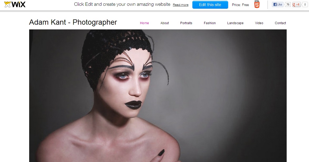
It has a large amount of features very similar to those of Weebly and Moonfruit. However, one thing it had that is unique is the ability to hire a professional to design your site for you. This could be very helpful for someone who is busy and doesn't have time to make it themselves, or someone who doesn't know how to make a website. Although, I don't know how, but I wouldn't hire a professional. I'd prefer to learn how to do it myself.

Monday 25 February 2013
Website builders: Weebly
I had a look at Weebly next, as I've seen a few fellow students on my course with sites using it.

Straight away I have a problem, it terms of how it is linked to facebook. I don't like that at all, it makes me think it's not going to be very professional. However, on a good note, it has a video to show you how to create your own website. This is the first website builder I've found with a help video.
 Above is the first themes/templates that Weebly shows, and my first impressions aren't exactly good. They all look a bit tacky and unimpressive, and don't seem to work well for showing images. Although they do have clear text and clear navigation buttons.
 Above is the list of features Weebly has, and these are all included in the free package. This is far more impressive than the preview of templates, showing a wide range of helpful features. I still can't decide which website builder to use, but if I chose Weebly I will make sure it isn't connected to my facebook.

Straight away I have a problem, it terms of how it is linked to facebook. I don't like that at all, it makes me think it's not going to be very professional. However, on a good note, it has a video to show you how to create your own website. This is the first website builder I've found with a help video.


Website builders: Moonfruit
Now I've analysed some live websites, I know what makes them good and bad. So I'm going to look at some website builders and compare what they offer and how their templates suit my needs. The first website builder I have found is Moonfruit:


It offers a large amount of templates to chose from, all of which suit different types of websites depending on what you want. From restaurant website designs, to hotel website designs, and of course photography website designs. I found the photography based ones, and a few others that just caught my eye in general.

The above template would allow images to be nice and large, covering a huge amount of the screen. A vital aspect for my site I think, as well as the section for text at the bottom.


The above template provides good navigation and even has a search bar, which could be helpful for my website. However, I don't like the clothesline presentation of the images, it doesn't look professional in my opinion.

This template is far too busy. I believe there are a lot of photos in one place, they all vary in size and are shoved together like a collage. However, the contact information is in plain site at the bottom and I like that about it.

This last template caught my eye mainly due to the image of the spiral stairs, and makes me think that if I had one of my own photos there it would also stand out. It's a nice big image that spans the entire screen, with a space for the project title on the bottom left clearly in view.
Moonfruit has several different packages available, some for purchase and some for free. The image below shows what is included in the free package, and the cheapest package for purchase.

The price shown is what they charge per month, and as you'd expect the better the package the more money it costs. The most expensive package is £25, which in my opinion isn't as pricey as I thought it would be. One negative of the free, standard and lite packages, are that they don't include the ability to be used on a mobile.

I'm not sure if I will use this website builder or not, but I have found it easy to understand. I plan to decide which I'll use once I've looked at a few other builders.
Sunday 24 February 2013
Website analysis conclusions
After having a look at some active websites, I've compiled a list of things that I think make a good website. It's essential for a photographer to have a website in this day and age, so people can browse through their work and find out what they're all about. A photographers website will possibly be the first thing a potential client sees, so first impressions are important.
Easy navigation
If your website is difficult to navigate there is a major risk viewers won't even bother to try and work it out. Having easy navigation through your website will make for a positive experience overall. Users will be able access specific areas they want too, and avoid any pages they don't want to look at. Navigation is possible the most important part of your website, so making it easy to use is vital.
Up to date content
Photographers are constantly making work, so why shouldn't they update their website regularly? Having work that is years old on your site, may mean it is no longer relevant, and could be taking up space you could use for newer work. A website that is updated perhaps once a week at least, shows potential clients that you are actively working and making an effort to share this work enthusiastically.
Clear information
Most information on a photographers website is either their contact details, or descriptions of their work. How is a user going to know how to contact you if that information isn't clear cut and easy to read? Keeping information clear is simple enough to do, and the websites I've looked at have managed this by keeping their backgrounds white and their text black.
Image size
Some of the websites I have looked at don't quite comply with this aspect. A photographers website is primarily for displaying their work, so the image sizes are important. Having small thumbnails to show a lot of images at the same time, is fair enough and a sufficient way of giving users a choice of where to look. However, at some point these small images need to be seen bigger. By big I mean they need to take up almost the whole screen, as this is really the only way to do the images justice.
Friday 22 February 2013
Website analysis 3
The next few websites I looked at belong to my University tutors; Mark Edwards, Geoff Buono and Matthew Andrew. All three of them are similar in several ways;
 Mark Edwards and Geoff Buono both have title pages for their websites, which have to be clicked on before you can enter the whole site. This could be seen as a good idea or a bad, depending on each individual looking at the site. I personally believe that although they look good and give their sites a more professional feel, these pages are not necessarily needed. Some users may find it annoying and not even bother to enter the site. Geoff has a photo on his title page though, which grabs your attention immediately and I quite like it. Whereas Mark simply has his name.

Matthew Andrew's website does not have one of these pages, and gets straight to the point. One of his projects shows up straight away, catching my attention and getting me interested in finding out more about it.

All three websites are easy to navigate around, listing different areas of their sites on the left hand side of the screen. Mark's site is the only one that includes any colour in the background, while Matthew and Geoff have simple white backgrounds. While the plain white makes sure there are no distractions from the work, and does make them look professional, it could be seen as boring by some viewers.

All three sites have a nice amount of images for viewers to look through, and they are presented pretty centrally on the page. My only problem is their size, they aren't particularly big. There is also no option to make them bigger, what you see is what you get so to speak. I would have liked to be able to see them bigger, even if it is only by a little bit.

All three sites have the option to contact the photographers, and it is easy enough to find the buttons for this. Geoff's website is the only one that has a separate page for contacting him, and it has a photo of himself younger. This is a lovely little touch that adds a sense of personality to the site.

However, clicking on the contact button doesn't always work. I clicked on all three, several times and nothing happened. This could be a problem only I had though, so it may not count for much. Overall, I like how all three of these sites look and how easy they are to navigate. There are a good amount of photos on each site, not too many, but not too few either. The only improvement I believe would be beneficial is enlarging the images, maybe creating a slide show presentation like on Stephen Gill's site.


Matthew Andrew's website does not have one of these pages, and gets straight to the point. One of his projects shows up straight away, catching my attention and getting me interested in finding out more about it.


All three sites have a nice amount of images for viewers to look through, and they are presented pretty centrally on the page. My only problem is their size, they aren't particularly big. There is also no option to make them bigger, what you see is what you get so to speak. I would have liked to be able to see them bigger, even if it is only by a little bit.

All three sites have the option to contact the photographers, and it is easy enough to find the buttons for this. Geoff's website is the only one that has a separate page for contacting him, and it has a photo of himself younger. This is a lovely little touch that adds a sense of personality to the site.

However, clicking on the contact button doesn't always work. I clicked on all three, several times and nothing happened. This could be a problem only I had though, so it may not count for much. Overall, I like how all three of these sites look and how easy they are to navigate. There are a good amount of photos on each site, not too many, but not too few either. The only improvement I believe would be beneficial is enlarging the images, maybe creating a slide show presentation like on Stephen Gill's site.
Tuesday 12 February 2013
Website analysis 2
The second website I looked at was Stephen Gill's:
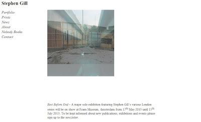 The home page is quite plain, a simple white background with black writing. A photo is also shown, but unlike Parr's website it isn't very big. I would personally prefer the image to be bigger, although a positive point is that the images are on a loop and change regularly.
 The portfolio section of the website is pretty clear and easy to navigate, listing the different projects which can then be clicked on:
 Once clicked on, the images grow to a much better size. There is a navigation bar at the bottom which allows you to skip to any image you want, and when hovering the mouse over them it gives you a small preview. I really like this feature.
The contact page is easy to find and very easy to understand. There are several ways to contact Gill, and this page also included where to contact for prints. A image is displayed above the information, all of which is centred, this makes it look better in my opinion.
 Altogether I like Gill's website, despite how plain it is, this doesn't detract from the overall feel of the site. The navigation is easy to see on the left hand side, making it simple to move through the website and prevents any complications.


The contact page is easy to find and very easy to understand. There are several ways to contact Gill, and this page also included where to contact for prints. A image is displayed above the information, all of which is centred, this makes it look better in my opinion.

Sunday 10 February 2013
Website analysis 1
We have been given a task at uni, to look at some different photographers websites and write up reviews on them. The aim of this task is to get me more informed of what photography websites look like and what information they include, as well as what aspects work and what don't. Ultimately, it will help me decide on what platform to use for my own website when I come to make it. The first website I have taken a look at is Martin Parr's:
 The first thing I obviously noticed on the home page was the big photograph in the middle. I like that it's big and in your face, it shows you straight away what Parr does and shows that he's proud of his work. The photo changes every so often as well, which is good so it doesn't stay on the same photograph and get boring. I like that his name is in bright red, but I'm less decided on the icons in the top right corner. Here's a better view, with the mouse hovering over one to divulge what its for:


These icons look quite nice, but some of their purposes aren't immediately apparent. Some people may not like to have to hover their mouse over every single icon, and decide to just leave the site altogether.
Parr has a link to his blog, displayed below:

I liked this aspect straight away, especially the archive list on the right. It makes things a lot easier for the user, they can find what they want without having to trawl through pages and pages that aren't helpful to them.
Parr's website has an FAQ page which I think is very helpful and actually rather unique, as I've never seen one on a photographers website before:

Only the questions are displayed, and can be clicked on the retrieve the answer. I think this is a good idea that works a lot better than if the answers were displayed too, it would become much to crowded like that.
The contact page is easy enough to understand and navigate around, including how to contact his studio and him personally:

The text boxes are labelled clearly, and a phone number is displayed on the bottom if someone doesn't wish to fill in these boxes. I like the additional photo on the left with the letter box too, it goes well with the subject of this page and makes it more interesting to look at.
My only problem with Parr's website, is the lack of a portfolio. Yes, he does have some recent work on there, but not any of his older stuff. I would have liked to have seen more of his work, with maybe a small amount of text to go with them. Other than this, I think his website is a pleasing to the eye and a overall success.
Subscribe to:
Posts (Atom)